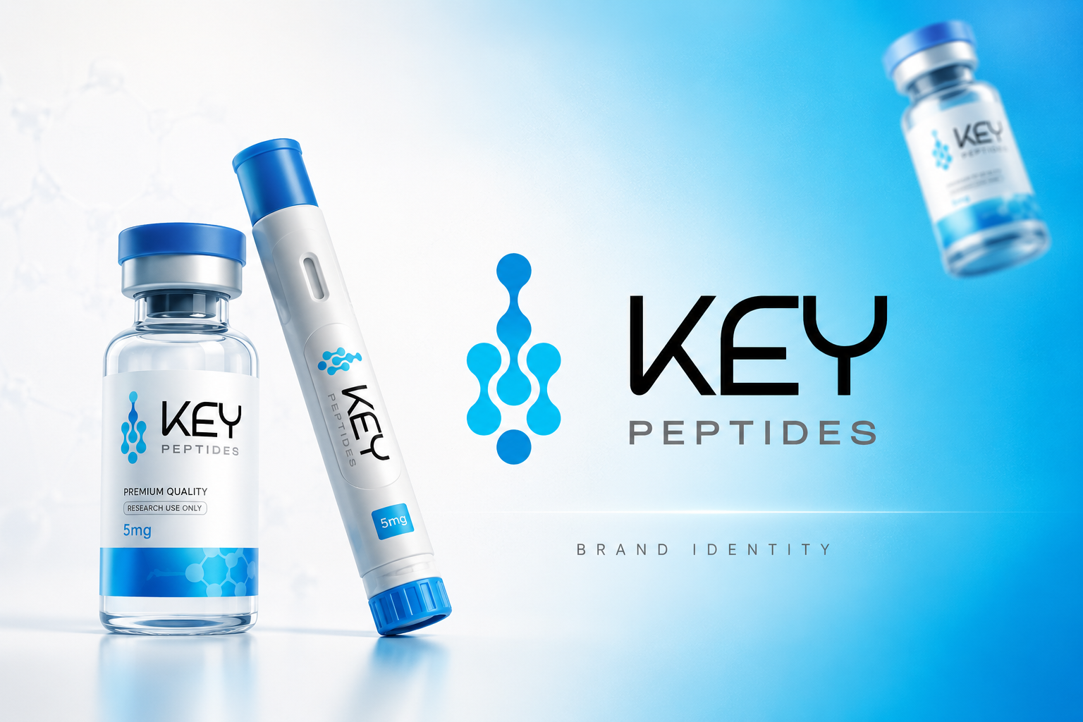
KEY Peptides — Brand Identity
June 2025KEY Peptides
Premium supplement brand identity with product packaging
A clean, clinical brand identity for a peptide supplement company, featuring a molecular node logo and product packaging design for vials and injectors.
Challenge
KEY Peptides needed a brand identity that balanced scientific credibility with premium product positioning in the competitive supplement market.
Solution
We designed a minimalist logo featuring a chain of connected molecular nodes, paired with a blue gradient system and clean product labelling for vials and pen injectors.
Results
The identity positions KEY Peptides as a premium, research-focused brand with a visual language that translates seamlessly across packaging and digital platforms.
Problems We Solved
What We Fixed for This Health Supplements Project
The challenges this client was facing — and exactly what we delivered to fix them.
The Problem
No consistent brand identity
Logo looks outdated
Inconsistent visual identity
No brand recognition
What We Delivered
Created a complete, consistent brand identity
Designed a modern, memorable logo
Unified visual identity across all platforms
Built brand recognition with cohesive assets
Facing any of these problems? Book a free check-up and we'll show you exactly what to fix.
Gallery
Project Gallery



Client Feedback
L3 Company completely transformed our brand identity. The new logo and visual system made us look like a premium business overnight. We've never received so many compliments.

Ready to Grow?
Want results like this for your business?
Take our 60-second growth quiz and get a free, personalised marketing plan — no obligation, no jargon.
This project was delivered by L3 Company Marketing — a UK-based 360° marketing agency helping local businesses grow online with strategy, design and technology.
Meet the team