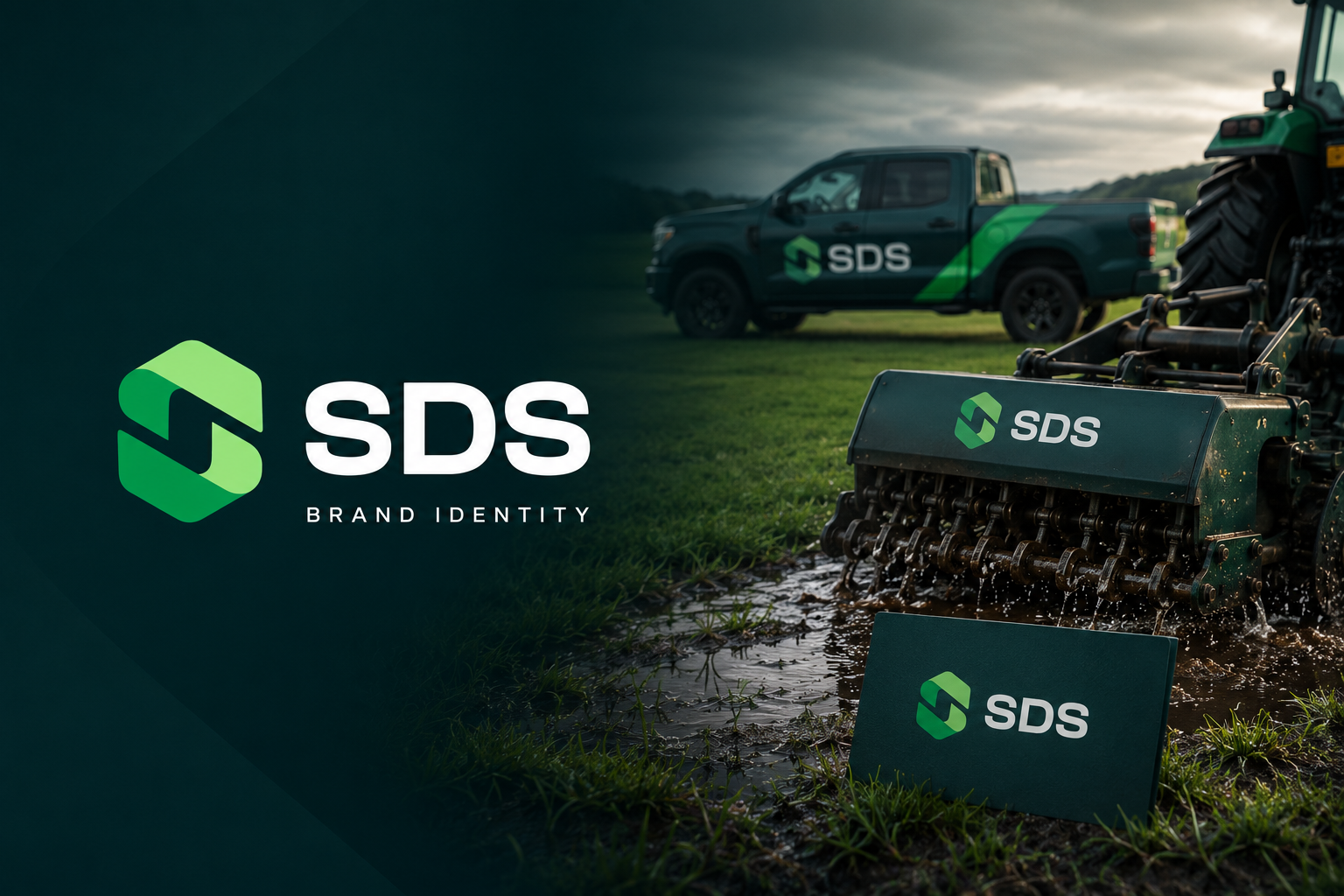
SDS — Brand Identity
March 2024Soil Decompaction Services
A professional identity built from the ground up
Complete visual identity design for SDS (Soil Decompaction Services), a UK-based ground care company. The brand was crafted to communicate technical precision, professionalism, and trust — designed by Ruan Kypson at L3 Company.
Challenge
SDS had no visual identity and needed a brand that instantly communicated their technical expertise in soil decompaction to sports fields, gardens, and commercial sites — without looking generic or amateur.
Solution
We constructed the logomark directly from the letter 'S' in 'Soil', giving it an unmistakable geometric structure. The colour palette uses deep dark green (#003333) for ground stability and depth, paired with fresh lighter greens (#09A14C, #98E87E) to represent renewal and soil health. Typography: Bahnschrift — clean and professional.
Results
A complete, cohesive brand identity delivered including primary logo, icon variant, brand pattern, business card design, and brand guidelines — ready for print and digital use across all touchpoints.
Problems We Solved
What We Fixed for This Agriculture & Landscaping Project
The challenges this client was facing — and exactly what we delivered to fix them.
The Problem
No consistent brand identity
Logo looks outdated
Inconsistent visual identity
No brand recognition
What We Delivered
Created a complete, consistent brand identity
Designed a modern, memorable logo
Unified visual identity across all platforms
Built brand recognition with cohesive assets
Facing any of these problems? Book a free check-up and we'll show you exactly what to fix.
Gallery
Project Gallery



Client Feedback
L3 Company completely transformed our brand identity. The new logo and visual system made us look like a premium business overnight. We've never received so many compliments.

Ready to Grow?
Want results like this for your business?
Take our 60-second growth quiz and get a free, personalised marketing plan — no obligation, no jargon.
This project was delivered by L3 Company Marketing — a UK-based 360° marketing agency helping local businesses grow online with strategy, design and technology.
Meet the team